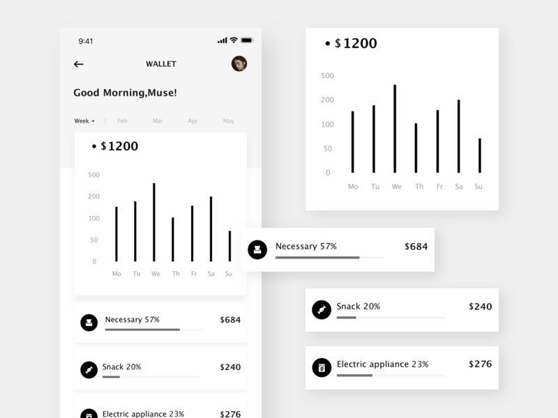
Design in grayscale first:

You start your design in black and white, designing in black and white gives room for creativity, gives room for experimenting with different shades of color.
A black and white design lets the smallest splash of color shine bright enough to beautify your web page, moreover designing in black and white helps you focus on other aspect of your design rather than being disturbed by the color, background, and scheme.
Always be consistent
You can't afford not to be consistent when trying to give your users the best designs and the best user experience.
In designing consistency matters, from the color schemes to the navigation and breadcrumbs.
The page's consistency tells a lot about the designer, the owners and also determimes the user's overall satisfaction when visiting your web page.
Make use of communicative images
An image could speak to your users or viewers more than a whole paragraph, if the right set of images are used it will better help your viewers to understand the message you're trying to convey through the paragraph and helps illustrate certain actions to get started with the service that your site offers.
Typography: Your font says a lot about hierarchy and creates clarity
Each type of font communicates its own feel and purpose, a bold could represent a point to note or a header. The font styles should fit in the particular mood of your website, because the wrong font family, color and spacing could ruin the entire design of the web page.
Example given:
A cursive font in this web page ruins the look
A courier font in this web page conveys a different message
Keep the interface simple
Some web designers over do it with the designs sometimes, they might abuse the use of hover effects, color mix and animations. Some add hover effects to every single element which just makes the design look more and more complex, thus having a negative effect on the UI and reducing the quality of the user experience.
Some might over do the color mix such as mixing up colors that does not complement the purpose of the site. An example would be using a pink and red background color or linear gradient for a food ordering site.
Make sure the website communicates the action
This simply means letting the user know where they are, the action they are taking, the state of their dashboard Et cetera. This is a common mistake among web developers and this mistakes brings about an unsatisfied user or a confused user. Unable to identify the page he/she is and this can be corrected through either headers, pop up and highlights on navigation links.
And the state of the site can be shown either through the path or an information modal.