Neo or Neumorphism simply means New Skeomorphism
The trend of skeomorphism which ended in late 2018-2019 gave rise to the new and improved Neomorphism. This new trends gave an open advantage for designers to create 3d plastic looking designs, and by 2020 - early 2021 this new trend was everywhere with designers, web developers and product designers trying out the new trend on their web pages and product giving it this fancy and subtle look.
Color scheme
Mostly, subtle colors are used such as off-white, soft greys or sometimes gradients are employed for better looks.
Effects:
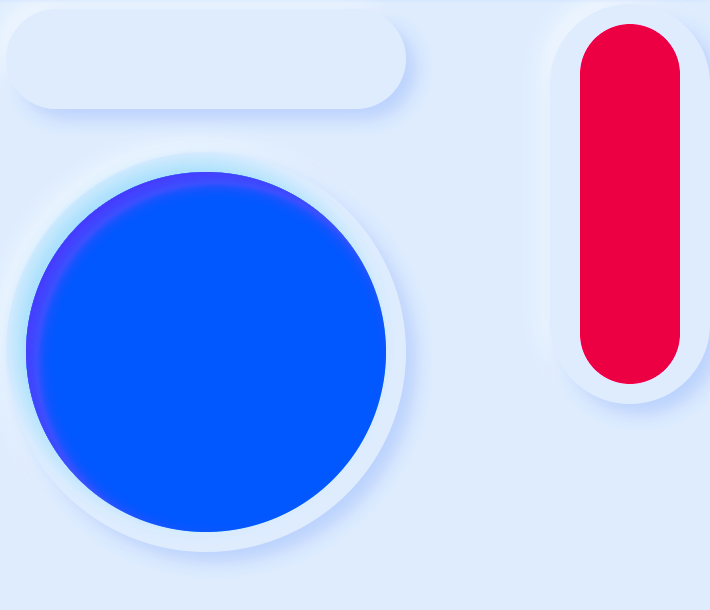
Neomorphism does not try to create a sense of reality, rather it creates a sense of 3d preservation using basic effects such as gradients, box shadows, inset box shadows and double drop shadows.
Pattern
The pattern of shapes are used, with shapes that could easily take on the form of neomorohism such as circles, pill shapes or boxes with smooth edges.
Observables:
Neomorphism tries to create a look that's just not subtle but looks 3d like it was either made with plastic or moulded with clay.
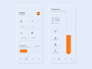
First using a subtle type of color auch as off-white background: #e0e5ec; and a box or circle with the same background #e0e5ec; and a box shadow of a darker and lighter color of your default color (your div color). box-shadow: -5px -5px 10px #babecc, -5px -5px 10px #f2f3f5; and you can go further to make it an inner shadow with "inset" or just leave the 3d pop look.
Demo can be seen below with the demo source code.
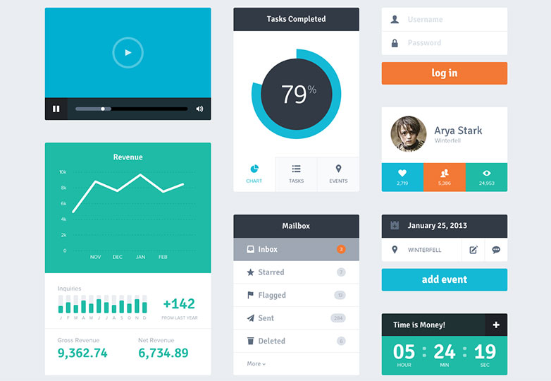
Flat design is a style of interface design emphasizing minimalist use of simple elements, typography, and flat colors.
It's general a design that most web designers prefer to use as it's easier to make responsive across all devices, flat design ui in most cases is contrasted with skeomorphism.
It is easier to quickly convey information while your designs looks appealing and attractive.
With minimal design elements, websites are able to load faster and resize easily, and still look sharp on high-definition screens.
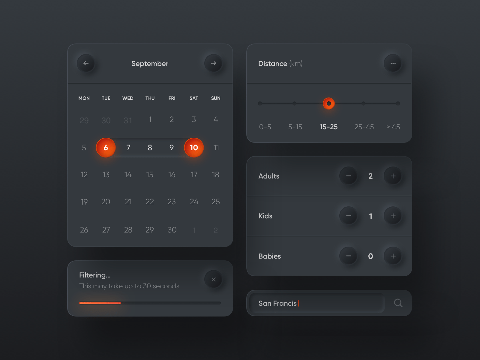
The dark mode UI is a design style that focuses on light text on dark background. The dark mode UI helps reduce light emitted from the device and this is important especially in web pages where there are a lot of reading content.
Dark theme UIs were created as a countermove to the dark-on-light color schemes, which simulated the appearance of ink on white paper.
This trend of dark mofe UI came to be in 2016 when Twitter tested with a light-on-dark color theme. But as we all know, that's not the first appearance of light-on-dark color scheme, some old systems had worked with light texts on dark background. But however, this trend became popular when Apple released a dark mode option in the iOS 13 update, and from then on the dark mode trend seemed to have taken However, off and has become more preferable.
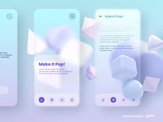
Glassmorphism as a UI trend is a type of effect that involves a frosted glassy look. The user sees a semi-transparent layered background and either a gradient background or a background with complex images of different shades of color.
To achieve this effect a background body or container of mixed color is needed and a blured object and a semi-transparent edge to compliment the frosted glass look.
Memphis design
